Fonts for Print
Choose clean, readable fonts that make your book comfortable to read.
Why Fonts Matter
The font you choose affects how easy your book is to read and how professional it looks.
Good fonts:
- improve readability
- reduce eye strain
- create a polished appearance
Poor font choices can make even great writing feel harder to read.
Best Fonts for Print
Common choices:
- Times New Roman
- Garamond
- Georgia
These fonts are widely used in books because they are easy to read over long periods.
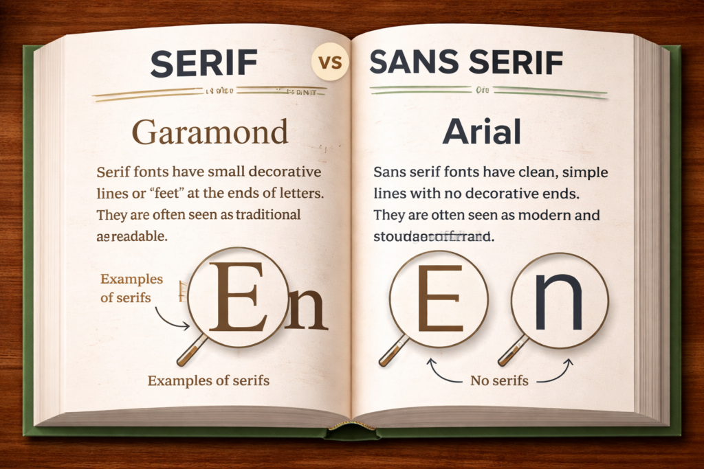
Serif vs Sans Serif
Most print books use serif fonts (fonts with small strokes at the ends of letters) because they improve readability in long-form text.
- serif → Times New Roman, Garamond
- sans serif → Arial, Helvetica
For most books, serif fonts are the safer and more traditional choice.
If you’re unsure, Garamond or Times New Roman are safe, widely used choices for most books.
Font Size Guidelines
Typical sizes:
- 10 pt – 12 pt → most common
- 11 pt or 12 pt → safest for readability
Smaller fonts can feel cramped, while larger fonts increase page count and printing cost.
Consistency Matters
Your font should stay consistent throughout your book.
Keep consistent:
- body text font
- font size
- spacing
Consistency is what makes your book feel clean and professional.
Where You Can Vary Fonts
It’s okay to use different fonts for:
- chapter titles
- headings
- section breaks
But:
Keep your main body text font consistent.
Common Mistakes to Avoid
- using decorative or script fonts for body text
- mixing too many fonts
- using fonts that are too small
- inconsistent sizing or spacing
Keep It Simple
You don’t need to experiment with dozens of fonts.
Focus on:
- choosing a standard, readable font ✔
- using a comfortable size ✔
- staying consistent ✔
When in doubt, choose a simple serif font at 11–12 pt and move forward.